Home › Forums › General Questions › Need your opinion on App Manager design
Tagged: app manager, design
- This topic has 11 replies, 9 voices, and was last updated 7 years, 1 month ago by
 jbetbe.
-
AuthorPosts
-
2019-06-07 at 9:00 am #15468
 Alexander KovelenovStaff
Do you like this new App Manager design with stacked icons? Please leave your feedback below.
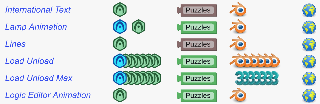
Please note that we’re also planning to do a separate app mode where you can manage all of your assets on a bigger layout.
 2019-06-07 at 9:11 am #15474
 Mikhail LuzyaninStaff
You also need to show people this.

Attachments:
Co-founder and lead graphics specialist at Soft8Soft.
2019-06-07 at 3:46 pm #15482NewFake
Customer


NewFake :)
2019-06-07 at 3:55 pm #15483 AndrejusParticipant 2019-06-08 at 8:12 am #15484
Anonymous
Inactivego for it!
suggestion: Dark mode2019-06-11 at 7:25 pm #15520jem
CustomerHi Alex,
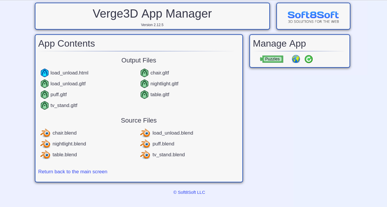
I agree that the current UI does not support large projects well. When you are designing the new separate app mode, please think about what the new screen will look like when it is used for very large projects. for example I have a project with approximately 500 separate GLTF source files (See screen shot). I am not a UX designer, but I think that some type of sort, filter and find options could be very useful.
Thank you for working on this!Jeremy Wernick
2019-06-12 at 7:48 am #15526Alexander KovelenovStaff2019-06-12 at 10:54 am #15536 illussimoCustomer
Hello Alexander,
Both would be a great improvement. An option for a dark theme would be nice as well.
Personally, I keep my Blender files outside of the Verge3D folder but visually stacking the files will be useful if one wants to keep all the blender files within the Verge3D folder and has many gltf files in one project.
A search system (also in puzzles) would be very helpful. But we will have to stay organised as well with naming our assets in a practical way.
Thanks! 2019-06-13 at 10:29 am #15549 elkCustomer
If there is going to be a separate single project layout, a greate feature would be to be able to choose what html,gltf/glb and blend files to display on the main page. I often have extra test blends and while blender 2.8 is in beta I also keep more “backups” then usual so the folder gets files up and the app manages start to get cluttered.
Maybe an option to only list items from the root project folder would also work, so people can stash thing “out of view” in sub folders …
And they need to break to a new line like now after a certain number, If it ends up like Mikhails screenshot it is useless.
I am not a big fan of the applications folder, I would mutch rather ba able to have my projects wherever I want, but this could be a great improvement. Nice work so far
Also I would love to see an open local folder button to go directly to the folder, but that might be difficult i guess bacause of security restricitions of browsers.
2019-06-13 at 11:36 am #15555elkCustomerohh, and also a rename or a clone/copy project would be nice, that way you can easily set up a copy for testing stuff or whatever, or you can easily set up template project as a base for new projects.
2019-06-13 at 1:42 pm #15569Alexander KovelenovStaff2019-06-17 at 9:11 pm #15699 jbetbeCustomer
Hi, I like the new window app mode but I see rather strange all the app content and source files in a row. Sorry, maybe it’s not the right expression but it’s how I feel it.
 I don’t know what it’s the best aesthetic solution.
I click straight into the app mode if I want to see all the files, as I’m saying it’s good to see it like this but the first window of the app manager it could be more into the app creation, the list of your apps, some support and network links, your registration key and few more.I vote for dark mode too!
-
AuthorPosts
- You must be logged in to reply to this topic.