We use cookies to ensure that we give you the best experience on our website. If you continue to use this site we will assume that you are happy with it.

How to adapt device screen size

Home Forums General Questions How to adapt device screen size

Viewing 5 posts - 1 through 5 (of 5 total)
  • Author
    Posts
  • #18280
    karl36
    Customer

    I test my work on PC very well.When I open it on my phone,the model and UI looks too small.
    I find some files say “<meta name=”viewport” content=”width=device-width, initial-scale=1″>”
    Emmm….where to import this code?

    #18281

    You can set different camera position for mobile, vertical/horisontal screen and any other situation using puzzles, like it done in scooter demo.
    Here you can see that position of the camera changes accortion to screen orientation.

    To scale your your interface better to use css rules that set different size for each UI elemts according to screen size, like it done in each of our demo in the sdk.

    Attachments:
    You must be logged in to view attached files.

    Co-founder and lead graphics specialist at Soft8Soft.

    #18284
    karl36
    Customer

    Thank you for your reply.

    #18293

    :good:

    Co-founder and lead graphics specialist at Soft8Soft.

    #38536
    veljet
    Participant

    Hi guys,

    I’m Ted, new to Verge! And I can’t seem to figure this out properly or I am missing something. Here we go:

    I recently started to test out Verge3d for our future projects. In practice we design and build websites based on WordPress CMS with the Elementor page builder. So like the Webflow part, we put a HTML UI on top of the canvas with elementor.

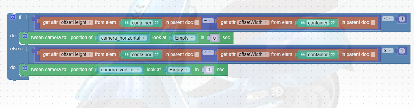
    I set the “Sensor Fit” on the camera to vertical like the pocket knife tutorial suggests, but this didn’t seem to do the trick.

    My scene is not reacting to Mikhail’s solution either. The container you’re targeting; Did Verge create this within html of the scene like scooter.html? Because I can’t find the class “container” in any of those files, could you explain how this works?

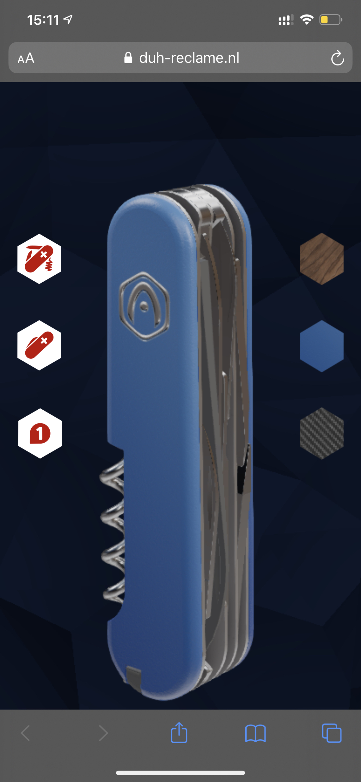
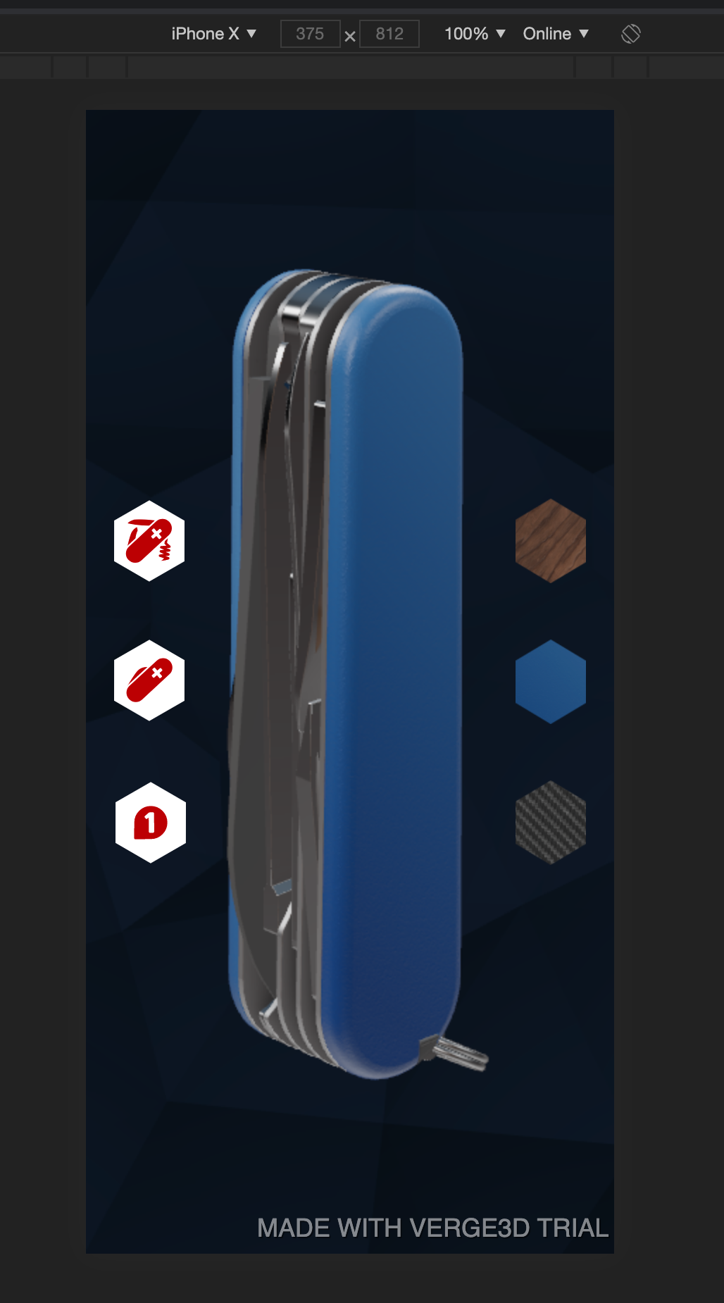
    I added some screenshots. On my Google Chrome inspector preview it works fine. On my iPhone 11 pro max it adds a Safari control overlay on the bottom of the page which seems like the issue making the VH larger and there for not positioning my scene or buttons in the center on a mobile device cause this is an overlay.

    Maybe I missed something, I would appreciate some help!

    Ted

    Attachments:
    You must be logged in to view attached files.
Viewing 5 posts - 1 through 5 (of 5 total)
  • You must be logged in to reply to this topic.