Home › Forums › General Questions › Change the product page layout for Mobile when using WordPress and Woocommerce
Tagged: woocommerce mobile
- This topic has 11 replies, 3 voices, and was last updated 3 years, 4 months ago by
bigmike814.
-
AuthorPosts
-
2022-12-30 at 1:08 pm #59292
darstudio
CustomerHi, we’ve been building a customizable product using Verge3D for our WordPress site using Woocommerce. However, I am really struggling with understanding how to make the Verge3d embedded window resize properly on mobile. (I need it to be more of a horizontal orientation on mobile, and vertical format on desktop).
A lot of trial and error allowed me to find a sort of in-between size and (together with applying styling to the product page elements where possible) it sort of works, but it is not ideal. I tried to set the max-height to 400px in the CSS folder of the Verge3d application using @media only screen and (max-width: 760px) to the #v3d-container class, etc. It’s difficult and doesn’t seem to work on the live site.
Another big problem is that, even though I can set the image element that later is replaced with the Verge3d application to be sticky on mobile (and this works in the site preview mode), it does not actually work on the real page when loaded. The 3d canvas stays static, and that’s quite frustrating since I would prefer the image to stay on top even as people scroll down through the product options. So that when they actually change then, they can see the image and how it updates. I tried to add another embedded version of the application using the code block, that is styled for mobile. That worked in terms of applying the sticky effect and the styling, but it’s not effective because it doesn’t update with the woo product.
Basically, my question is, what is the workflow or proper way to optimise the mobile layout when using Verge3D with Woocommerce?
What I want to do is:
1. be able to control the size of the Verge3D window on mobile
2. make its position sticky on the product section it occupiesThanks.
2022-12-30 at 2:43 pm #59293kdv
Participantyou need to control the iframe size and position, not the v3d container
<div class="graphic-block" style="width: 50%; height: 50%;">
  <div id="3d_canvas" class="_3d-canvas w-embed w-iframe"><iframe src="recliner.html" width="100%" height="100%" frameborder="0"></iframe></div>
</div>
See the Recliner demo
Puzzles and JS coding. Fast and expensive.
If you don’t see the meaning in something it primarily means that you just don’t see it but not the absence of the meaning at all.
2023-01-02 at 10:58 am #59331CustomerHi, how do I add this to work with the iframe embedded in Woocommerce? If I add a separate embedded piece of code as you showed on the product page, I can style it and it works fine. But it doesn’t solve the problem since the 3d model does not recognise when the product variants have been updated and won’t change accordingly.
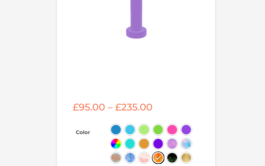
Notice int he screenshot how the product stays purple even though the orange material has been selected
Attachments:
2023-01-02 at 11:08 am #59333ParticipantYou don’t need to add a separate new iframe, you should treat the existing working one,
he iframe embedded in Woocommerce. If it doesn’t work I have no idea why. Show your app working and maybe I’ll find an answer.Also see this demo https://cdn.soft8soft.com/demo/blender/drink_shop/drink_shop.html
It changes the layout depending on the page orientation and width…Puzzles and JS coding. Fast and expensive.
If you don’t see the meaning in something it primarily means that you just don’t see it but not the absence of the meaning at all.
2023-01-02 at 11:17 am #59334CustomerThanks for the fast reply. Where would I add the #graphic-block class to apply to the iframe embedded in Woocommerce to have it work properly? That’s what’s puzzling me. The iframe is generated automatically and replaces the woocommerce-product-gallery block on the product page. Adding the class with the style in the CSS file in the application folder and then assigning the woocommerce-product-gallery block that class doesn’t seem to work. It’s very frustrating.
You can see the application in use here:
https://melbatoys.com/product/custom/
Password: cockadildodo
2023-01-02 at 11:25 am #59335ParticipantYou should treat the existing class
.woocommerce-product-gallery__wrapperadding new parameters to this class (width, height, margin, position etc.). Or other elements above. See the page structure in the browser console to find out what element you need to change. The page structure is a little complicated (unnecessarily complicated. a special cauldron in hell awaits them) so it will take some time )))
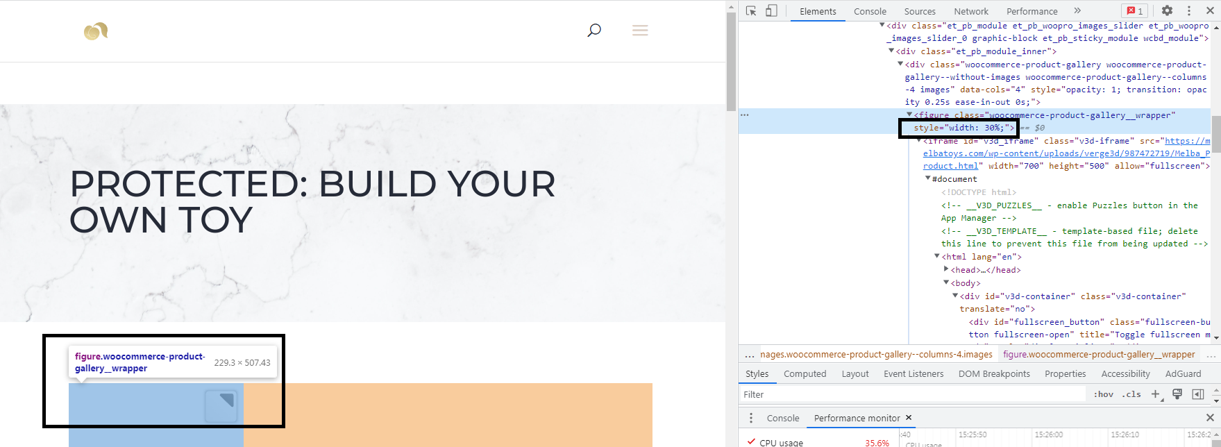
p.s. Your iframe has limited dimensions 700×500 px. Change them to
width="100%" height="100%"p.p.s. all woocommerce CSS files are here
...\woocommerce\assets\css\. That’s where you should tune the page layout…Attachments:
Puzzles and JS coding. Fast and expensive.
If you don’t see the meaning in something it primarily means that you just don’t see it but not the absence of the meaning at all.
2023-01-10 at 4:57 pm #59470CustomerThank you, I managed to make it work with this. Also, yes, the structure is very complicated, I’m not quite sure how to untangle it.
I’ve not been having any luck applying the sticky position, unfortunately, so if you have any idea about how to do that, I would appreciate it. In any case, thank you again!
 2023-01-10 at 5:02 pm #59471Participant
I’ve not been having any luck applying the sticky position
what do you mean? show an example of what you want…
Puzzles and JS coding. Fast and expensive.
If you don’t see the meaning in something it primarily means that you just don’t see it but not the absence of the meaning at all.
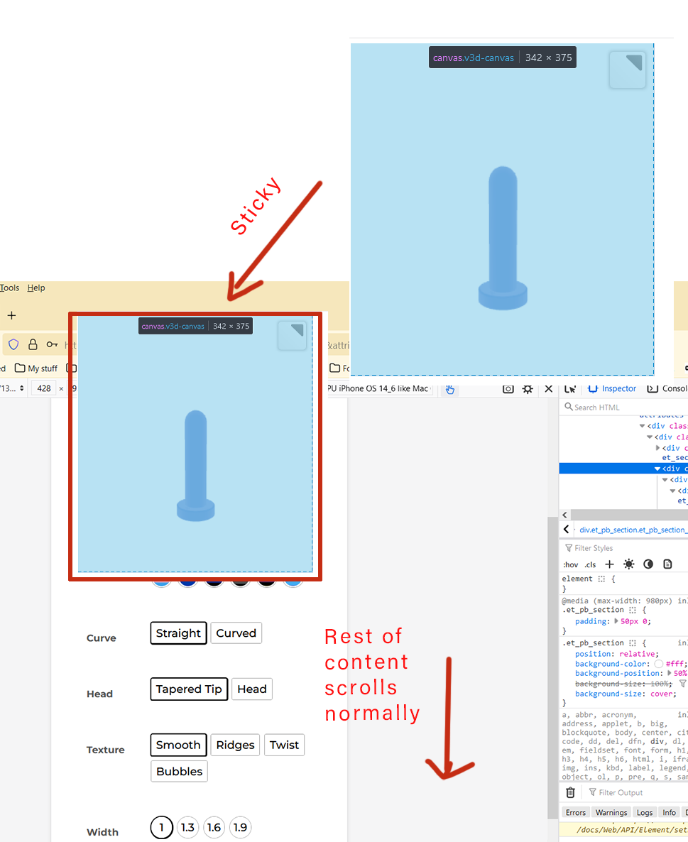
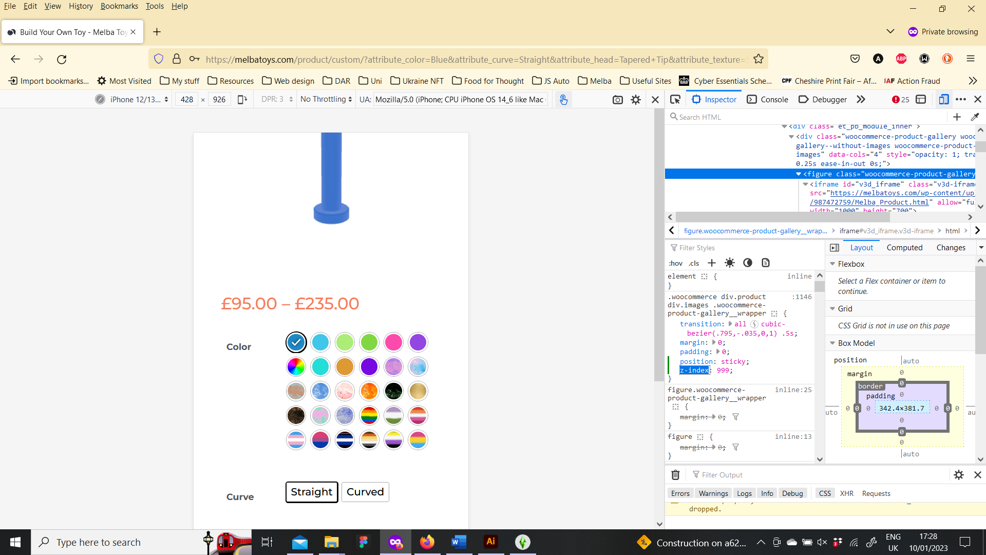
2023-01-10 at 5:17 pm #59472CustomerI want the 3d preview to stick to the top so even as people scroll through the product options, the image is always visible. I attached an image that should hopefully explain it.
Attachments:
2023-01-10 at 5:24 pm #59474Participanthttp://jsbin.com/omanut/2/edit?html,output
this doesn’t work?Puzzles and JS coding. Fast and expensive.
If you don’t see the meaning in something it primarily means that you just don’t see it but not the absence of the meaning at all.
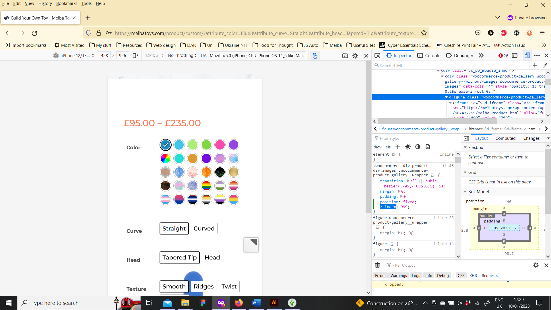
2023-01-10 at 5:32 pm #59475CustomerNot quite. If I set the position to sticky nothing happens (I do understand sticky is not always supported, though…) and if I try it with fixed I cannot seem to set the z-index, so the layering is all wrong. I set the individual z index of the other sections to a low number but it didn’t fix it.
2023-02-25 at 7:11 am #60668bigmike814
Participantlmao this is the funniest use case I’ve seen so far. The password is hilarious too.
3d Configurator | https://mc2sheds.com/builder
Site | https://mc2cpq.com
-
AuthorPosts
- You must be logged in to reply to this topic.